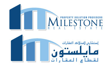
MILESTONE REAL ESTATE
Case Study:
The real state wanted to use a use standard color to represent buildings. The company is more of providing a solution for the property owners.
Results:
The client immediately approve the design, the are convinced about the use of the shape that was used the logo to represent their brand. The first dark blue shape represents Milestones itself and the swoosh shape on top of the two shapes represents that the company can cover and provide solutions for these property owners.
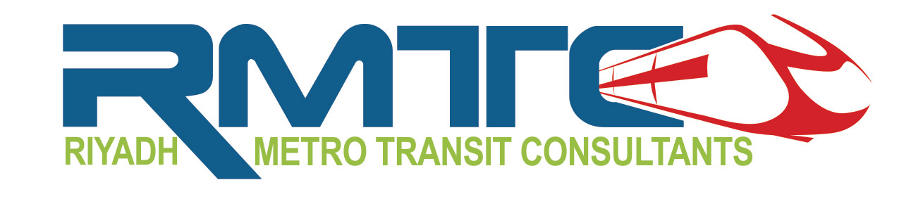
RMTC - RIYADH METRO TRANSIT CONSULTANT
Case Study:
It is proposed project in one of the major transportation of Riyadh where they want to represent the project with an identity of the consultancy who will win the job. They want to use a bold character with an engineering touch as well as to incorporate iconography to the logo.
Results:
The consultancy firm who won the project officially used the logo to represent Riyadh Metro in Saudi Arabia. The bold font used on the logo replicate the font of the consultancy firm of this project. The icon included on right side of the letters are replicated with the actual shape of the Metro.
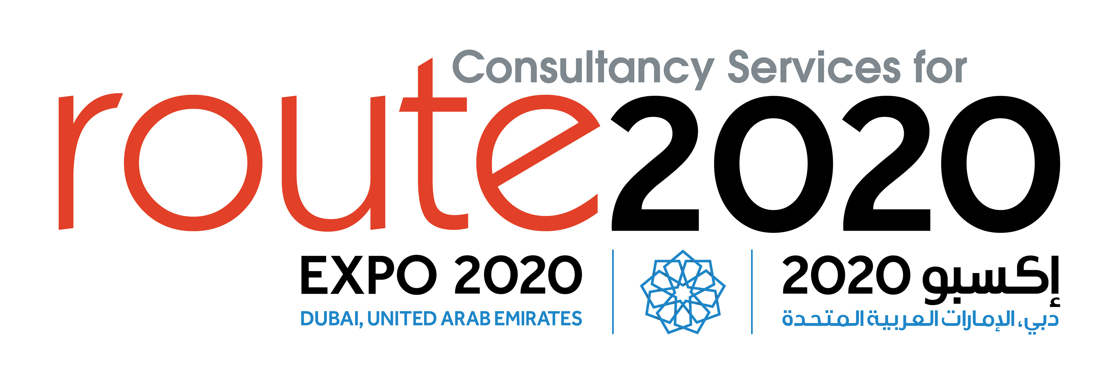
ROUTE 2020
Case Study:
It is proposed project for the additional metro route for 2020 in conjunction to the Expo2020 Dubai. The client wanted the consultancy firm who submitted their proposal to have an identity logo to represent the specific project for this purpose.
Results:
The consultancy won the project, the logo used a red color represents the continuation connection of the current red line route to Expo station. The numbers used for the logo replicate the font used in the official Expo220 logo to represent the project in conjunction to the successful EXPO2020 Dubai.


